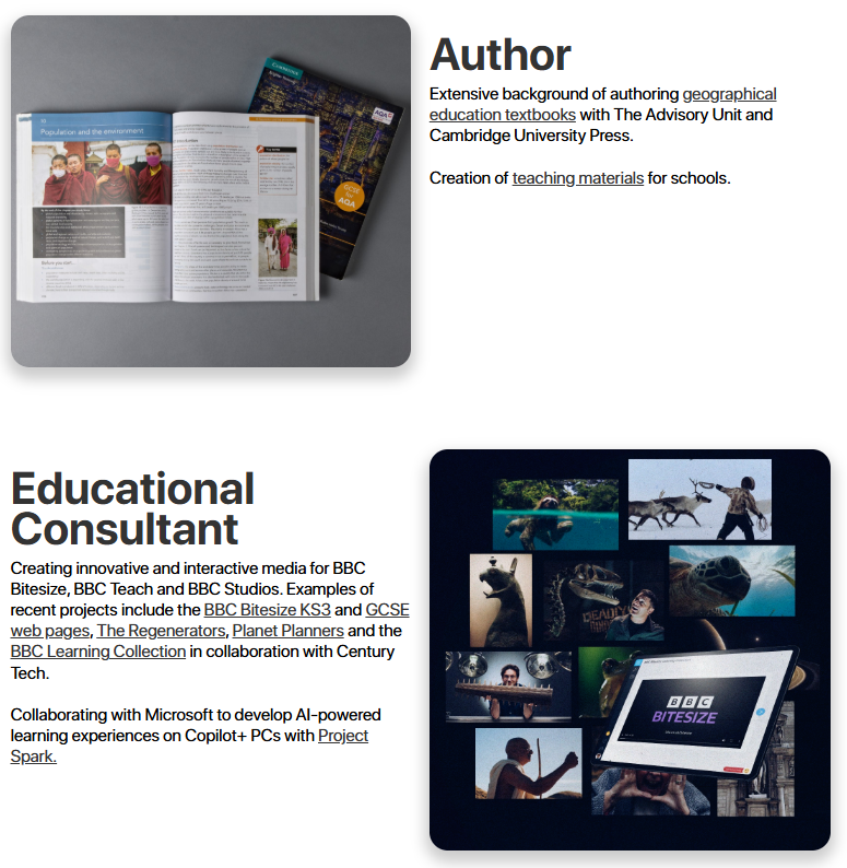
I. BRIEF
Helen Young is a geographer, educational consultant, author, scriptwriter, lecturer, and teacher. Her original personal brand, Geography Geek, built a loyal following among high school geography teachers thanks to a vast collection of free online teaching resources. However, as Helen’s career evolved, she began looking to reposition herself professionally. She wanted a brand that maintained the trust and recognition she’d earned in the education space while presenting a more polished, versatile image suited to consultancy, authorship, and speaking engagements. I worked with her and lead the redesign of both her website and personal brand to support this new direction.
II. STRATEGY
Helen’s original website had grown complex and unwieldy. It was built with outdated software, filled with unused pages and a huge archive of teaching resources. While it had served her well in the past, it no longer aligned with her goals and was generating no income. The new website needed to serve more as a “virtual business card” - a lean, modern platform that communicated her expertise and range of services clearly and professionally.
To streamline the brand and create space for monetisation, I advised moving her popular teaching resources to TES (Teaching Resources Marketplace). This allowed her to generate passive income while continuing to serve her loyal audience. At the same time, it freed the new site from being overly content-heavy, making it easier to focus on her consultancy work, publications, and professional credentials.
III. DESIGN
One of the most sensitive aspects of the project was redesigning her visual identity. Helen’s original “Geographer” logo had strong recognition among educators, and she was understandably hesitant to let it go.
The solution was to modernise it rather than replace it, retaining the logo’s core essence while refining its shape and style to better reflect her professional evolution. I produced a number of logo prototypes and surveyed members of her audience to gauge which direction resonated most. The final logo balanced its legacy with a clean, updated feel.
To complement the new visual identity, I chose San Francisco Pro as the primary typeface. Its clean geometry and subtle humanist details offer a blend of modern precision and approachability. This choice helped strike a balance between professional credibility and warmth, crucial for someone whose work spans both education and consultancy.
The website design followed a similarly minimalist philosophy. I conducted a full audit of her original site’s analytics to identify which pages were underused and could be removed. This allowed us to focus only on what mattered - showcasing Helen’s services, qualifications, and past projects in a simple, elegant structure. The process of arriving at the final design was highly iterative, involving multiple rounds of scamps, layout experiments, and branding reviews. Working on the website and brand identity in tandem helped ensure every element felt cohesive, purposeful, and aligned with Helen’s new trajectory.


IV. DELIVERY & PERFORMANCE
The finished site launched to a highly positive reception from Helen’s community. By migrating her teaching materials to TES, she has since accrued over 87,000 downloads and more than 205,000 views on her store page. Most importantly, the new brand strikes the right tone, maintaining the trust and familiarity of her original identity while presenting a clear and confident image to future clients and collaborators.
"It’s really nice for me to include my website on emails etc - it’s now something I’m proud of and that I feel represents me, rather than something that just serves teachers. It brings an element of professionalism that the site never had"
- Helen Young